

Often times, when we’re talking about tools to help us with testing, specifically automation tools, we hear a lot of preaching about not misusing these tools.
For example, people often ask how to use Selenium WebDriver – which is a browser automation tool – to do API testing. This clearly isn’t the right tool for the job.
While I most certainly agree that using the wrong tool for the job is not really efficient, I can also appreciate creative uses of tools for other means.
People “misuse” tools every day to meet their needs and end up realizing that while this specific tool was not designed for a particular use case, it actually works extremely well!
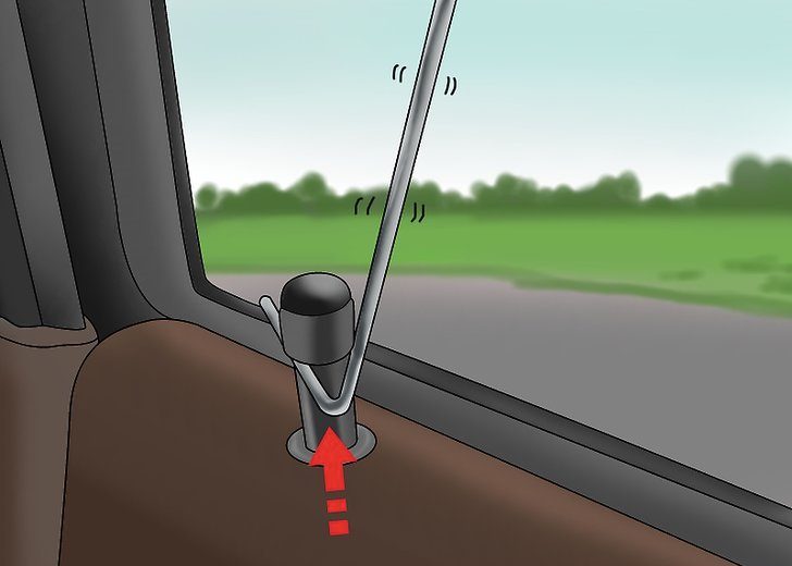
For example, here is a clothes hanger. It is obviously designed to hang clothing.
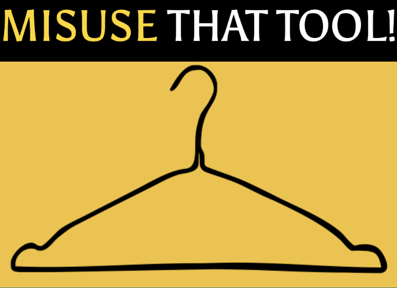
But necessity is the mother of innovation. So when you lock yourself out of your car, this tool all of a sudden has a new use!
Coca-cola was actually created as a medicine but after the manufacturing company was purchased, they began selling Coca-cola as a soft drink.
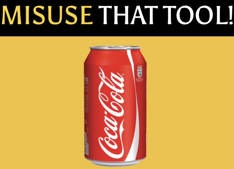
As if that wasn’t enough of a repurpose, coke can also be used to clean corrosion from batteries! (I should probably stop drinking this  )
)

So as we see, misusing a tool isn’t always bad. Some tools can be used for more than their intended purpose.
As engineers, most of us are curious and creative. This is a recipe for innovation!
Visual Testing
I’m working with automated visual testing a lot these days. It’s an approach that uses UI snapshots to allow you to verify that your application looks the way it’s supposed to.
Applitools does this by taking a screenshot of your application when you first write your test, and then comparing that screenshot with how the UI looks during regression runs. It is intended to find cosmetic bugs that could negatively impact your customer’s experience. It’s designed to find visual bugs that otherwise cannot be discovered by functional testing tools that query the DOM.
Take a look at a few examples of visual bugs:


While Applitools is second to none in finding cosmetic issues that may be costly for companies, I began to wonder how I could misuse this tool for good. I explored some of the hard problems in test automation to see if I can utilize the Applitools Eyes API to solve those as well!
Increase Coverage
Let’s look at a common e-commerce scenario where I want to test the flow of buying this nice dress. I select the color, size, and quantity. Then I add it to the cart and head over to the cart to verify.
And here’s the code to test this scenario:
Looking at the shopping cart, we’ve only verified that it contains the Tokyo Talkies dress. And that verification is by name. There’s a LOT more on this screen that is going unverified. And not just the look and feel, but the color, size, quantity, price, buttons, etc.
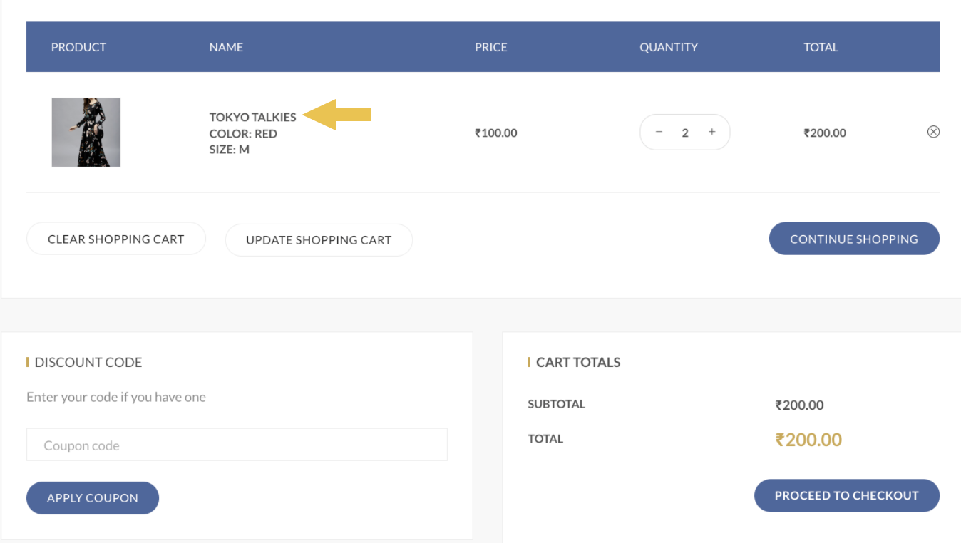
Sure, we can write more assertions, but this starts getting really long. We have doubled the size of the test here and this is just a subset of the all the checks we could possibly do.
What if I used visual testing to not only make sure the app looks good, but to also increase my coverage?
On line 10 here, I added a visual assertion. This covers everything I’ve thought about and even the stuff that I didn’t. And I’m now back to 11 lines here – so less code and more coverage!
Localization Testing
I worked on a localized product and automating the tests was really tough. We originally only supported the English version of the product; but after the product was internationalized, we synched into the localized Strings that development used for the product so we were at least able to assert on the text we needed.
However, not all languages are written left to right. Some are right to left, like Arabic. How could I verify this without visual testing?

Netflix internationalized their product and quickly saw UI issues. Their product assumed English string lengths, line heights, and graphic symbols. They translated the product into 26 languages – which is essentially 26 different versions of the product that need to be maintained and regression-tested.
And good localization also accounts for cultural variances and includes things like icon and image replacements. All of these are highly visual – which makes it a good case for visual testing.
Using Applitools, writing the test for different locales is not too bad, especially since you don’t need to deal with the translated context in the assertions. And the visual tests will verify the sites of each locale.
Looking at the English-translated version of this website, I can see a few bugs here.
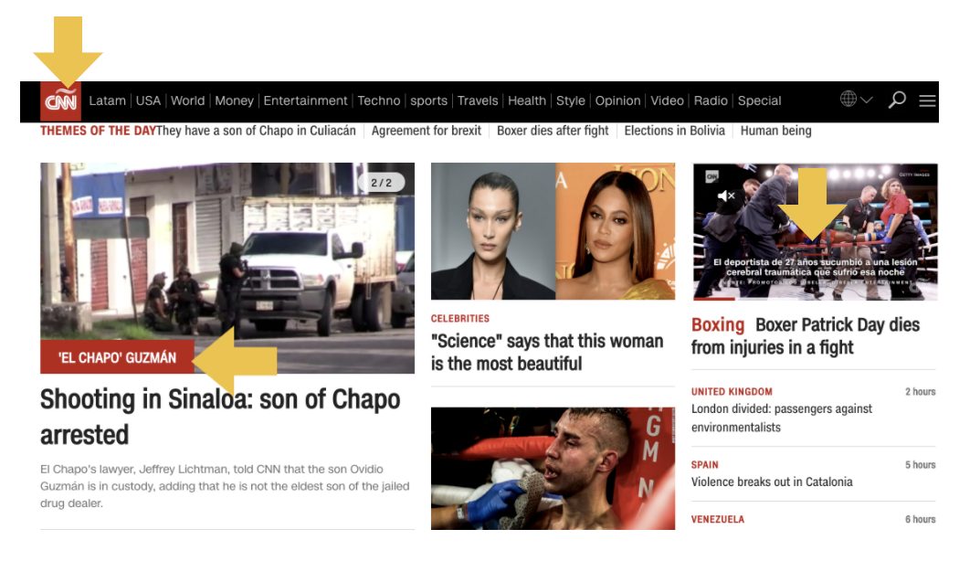
- The Spanish logo is being used
- The image overlay is still in Spanish
- The video captions are also still in Spanish
Trying to verify everything on this page programmatically without visual testing would be painful and can easily miss some of these localization issues.
Cross-Platform Testing
I’m sure anyone who has had to write test automation to work on multiple platforms would agree with me that this is not fun at all! In fact, this is quite the chore. And yet, our applications are expected o work on so many different configurations. Multiple browsers, multiple phones, tablets, you name it!
For example, here’s a web view and a mobile view of the Doordash application.
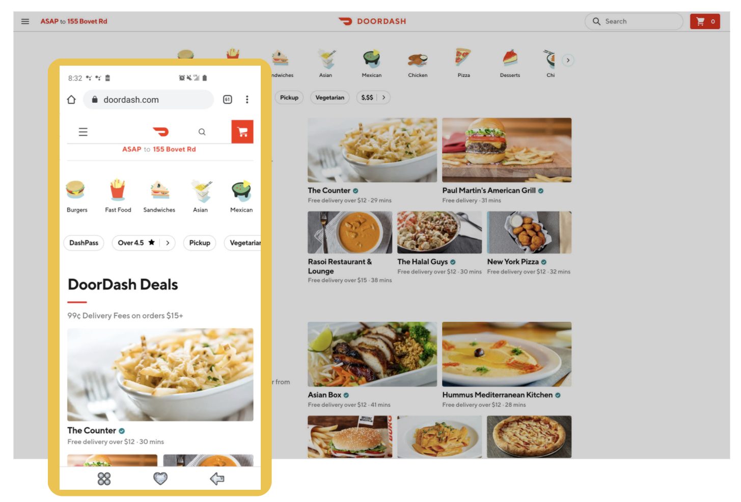
There are quite a few differences, such as:
- On the web view, the address is on the top row to the right of the menu, but on mobile it’s on the 2nd row and centered
- The site title exists on the web view but is not on the mobile view at all – only the logo
- The search field exists on the web view but only the search icon on the mobile view
- And the shopping cart shows the quantity on the web view but not on the mobile view
Because of these differences, we either need to write totally different framework code for the various configurations, or include conditional logic for every place where the app differs. Like I said, painful!
But the worse part of it all is that the return on investment is really low. I hardly find any cross-platform bugs using this approach. And it’s not because they don’t exist. It’s because most cross-platform bugs are visual bugs!
The viewport size changes, and all of a sudden, your app looks goofy!
So what if instead of just using visual testing to make sure my app looks nice, I bended this technology a bit to execute my cross-platform tests more efficiently?
Like instead of a functional grid that executes my tests step by step across all of the devices I specify, what about a visual grid that allows me to write my test only once, without the conditional viewport logic? Then executes my test and blasts the application’s state across all of my supported devices, browsers, and viewports in parallel so that I can find the visual bugs? 
That’s pretty powerful and yes, we can use visual testing to do this too!
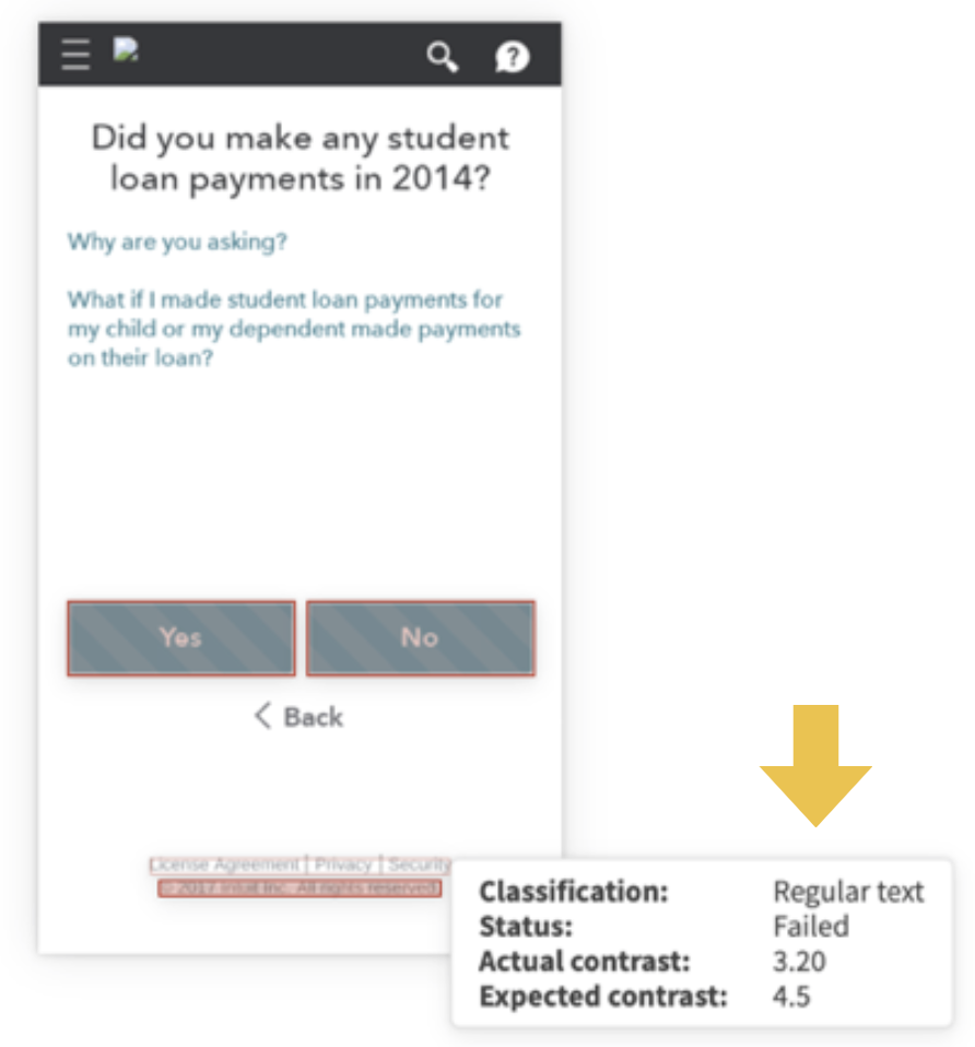
Accessibility Testing
There’s a lot of talk about accessibility testing lately. It’s one of those important things that often gets missed by development teams.
You may have heard of the recent Supreme Court case where a blind man sued a pizza franchise because their site was not accessible.
Supreme Court hands victory to blind man who sued Dominos over their accessibility. https://t.co/dhNELAlDgr Have you ever sued an establishment?
— Disability Horizons (@DHorizons) October 22, 2019
This is not a game. We have to take this seriously. Can visual testing help with this at all?
Yep, what if we used visual testing to be able to detect accessibility violations like the contrast between colors, the font sizes, etc? This could make a nice complement to other accessibility tools that are analyzing from the DOM.
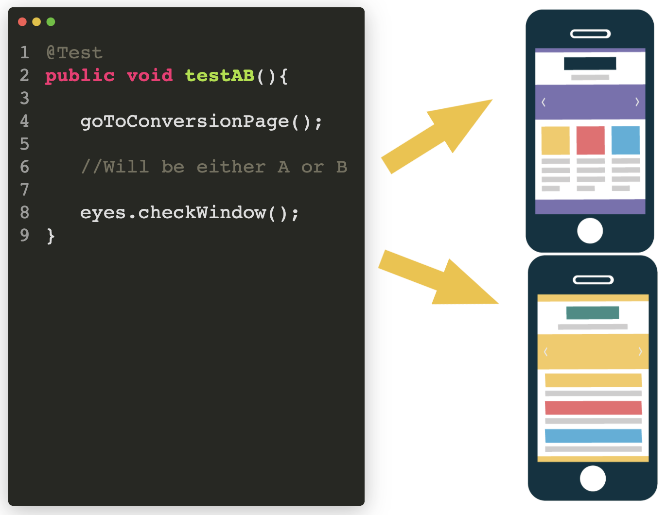
A/B Testing
A/B testing is a nightmare for test automation, and sometimes impossible. It’s where you have two variations of your product as an experiment to see which one performs better with your users.

Let’s say Variation B did much better than Variation A. We’d assume that’s because our users really liked Variation B. But what if Variation A had a serious bug that prevented many users from converting?
The problem is that many teams don’t automate tests for both variations because it’s throw away code, and you’re not entirely sure which variation you’ll get each time the test runs.
Instead of writing a bunch of conditionals and trying to maintain the locators for both variations, what if we used visual testing instead? Could that make things easier to automate?
Indeed! Applitools supports A/B testing by allowing you to save multiple baseline images for your app’s variations.
I could write one test and instead of coding all the differences between the two variations, I could simply do the visual check and provide it with photos of both variations.
Dark Mode
All the cool apps are now providing a dark mode option. But how do you write automated tests for this? It’s kind of an A/B type of scenario where the app can be in either variation. But the content is the same. So that makes it relatively easy to write the code but then we miss stuff.
For example, when Slack first offered dark mode, I noticed that I couldn’t see any code samples.
As much as I work with visual testing, it didn’t dawn on me that I could use visual testing for this until Richard Bradshaw pointed it out to me. In hindsight, DUH of course this can be tackled by visual testing. But in the moment, it wasn’t apparent to me because visual tools don’t advertise this as a use case.
Which brings me back to my original point…
Misuse Your Tools!
Most creators make a solution for a specific problem. They aren’t thinking of ALL of our use cases. So, I encourage you to not just explore your products, but explore your toolset and don’t be afraid to misuse (but not abuse) your tools where it makes sense.
The post The Many Uses of Visual Testing appeared first on Automated Visual Testing | Applitools.